MFE/MAE/Exit statistics in R

If you’re tracking your risk in Tradervue, you’ve always been able to view your P&L, as well as all of the reports, in terms of R.

We now also display Position MFE/MAE and Best Exit P&L in terms of R as well, if you have set an initial risk value for the trade. Here’s an example of how this looks:

If you don’t have a risk value set for the trade, you’ll still see these statistics as before, they just won’t be shown in R.

Advanced Reports – drawdown (MAE)

We’ve added Quick Report presets for a couple of popular reports on the Advanced Reports tab that we often get questions about.

Trade drawdown in R

This one shows Position MAE, otherwise known as drawdown, plotted in terms of R:
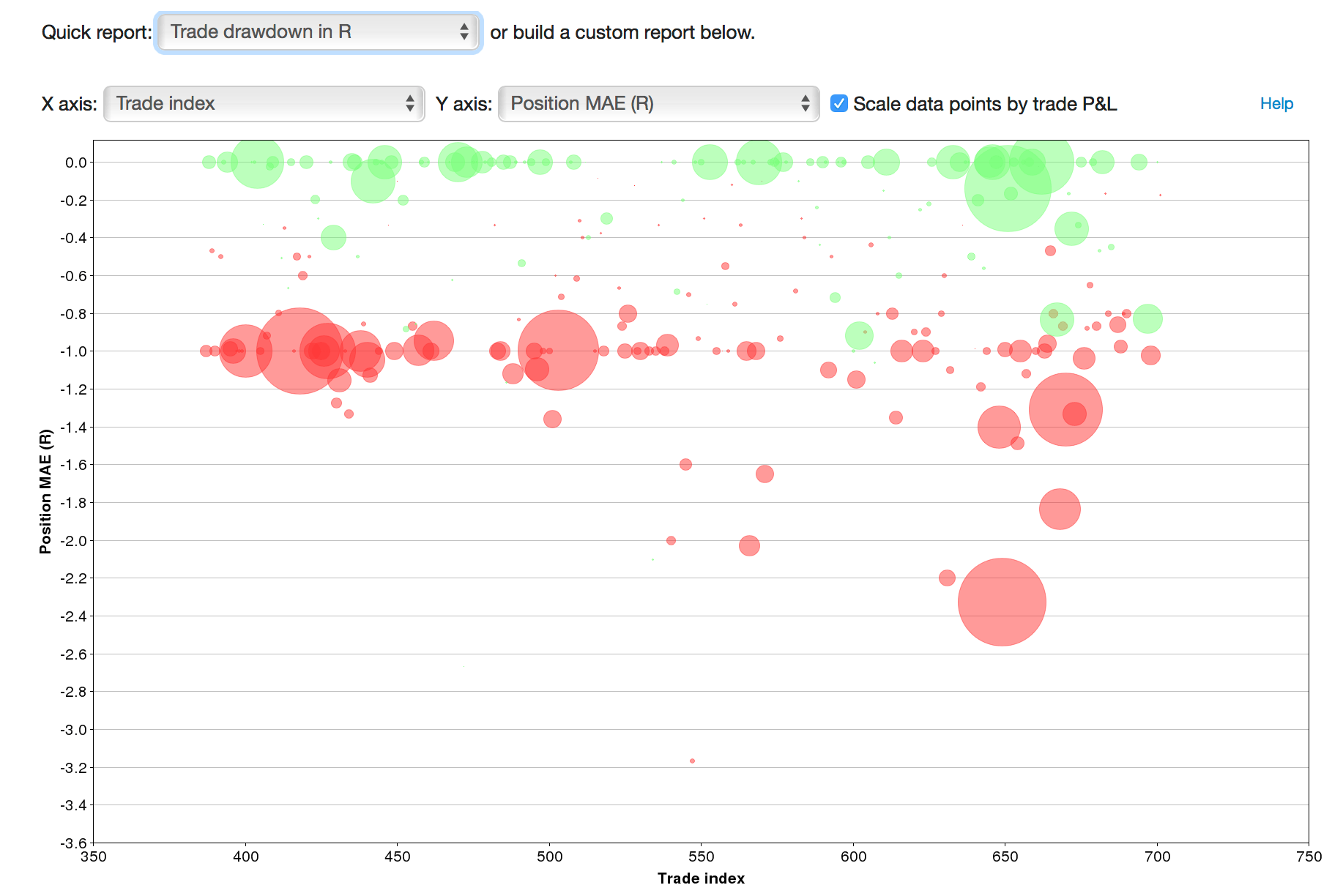
The X axis here is just an index, meaning the trades on the chart are spread out across the X axis.

Let’s think through this. R is the maximum risk you indicated you would allow in a trade. So if we see trades with a drawdown beyond -1.0R, that means you may not have honored your stop, and perhaps broke one of your trading rules.

The size of the bubbles are proportional to their P&L – so large red bubbles have a larger loss. However, seeing smaller dots (or even green dots) below the -1.0 line in this case isn’t necessarily a good thing – in all of these cases, you let your loss in the trade run in excess of your predefined max risk.

Trade drawdown – stop analysis

Here, we look at Position MAE, in $ terms:
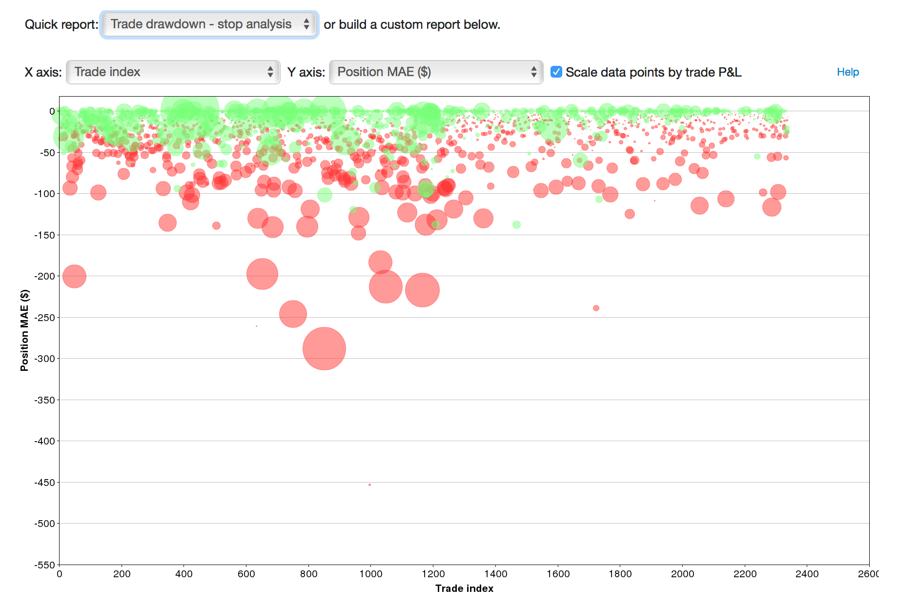
We’ve looked at this report before, but it’s now much easier to get to.

In the example here, we can see that any trade that ran against us more than $150 ended up being a loser. And in fact, almost all of the trades that ran more than $100 against us ended up losing, with few (and small) exceptions. So, we can say from the data that for the trades where we had looser stops, had we used a tighter stop of $100 (or $150), we would have done better overall.

Armed with this knowledge, we can now dive into the data and do some further analysis.

And more…

There are hundreds of possibilities you can look at in the advanced reports – definitely experiment with them, and see your data in a different light. For example, here we’re looking at Position MAE in R, plotted against our R in $:
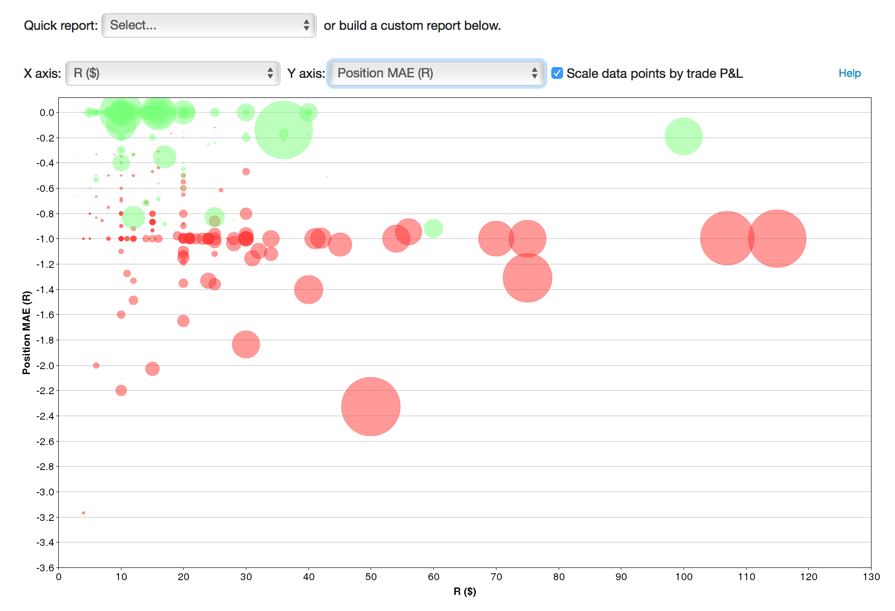
It’s similar to the first report, but a bit of a different view. We can see the trades that we let run below -1.0R as before, but now we can see just how big our R value was for each of those trades. So here, we can see that for R values over $60, we generally respected our stops; for R values below that, we often exceeded the amount of risk we had planned.

View times of MFE/MAE

When viewing a trade, you can see the position and price excursion data (MFE and MAE) right below the execution list for the trade, as described in MFE and MAE calculations. This data can be extremely useful for seeing your maximum interim profit or loss in the trade, and in aggregate can be very useful for analyzing stops.

Today, we have added the ability to see exactly when the MFE/MAE occurred in a trade. Simply hover your cursor over the MFE or MAE value you’re interested in, and you’ll see a small popup with the timestamp it happened at:

Especially when looking at position MFE/MAE, it’s not always obvious on the price chart where this occurs, if you’re scaling in and out of a trade. Having the timestamp quickly accessible makes it much easier to find!

MFE/MAE data is available for all silver and gold subscribers.

Trend report additions – MFE/MAE

We’ve added some additional statistics to the new trend reports that were launched a couple of weeks ago. Specifically:

  • Position MFE, Position MAE – the max favorable/adverse excursion of a trade’s total position value
  • Price MFE, Price MAE – the max favorable/adverse excursion of the instrument price during a trade, independent of position size

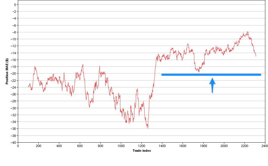
These new additions can surface some interesting trends in your trading. For example, here’s a 100-trade moving average of Position MAE:

trend_posmae 2

The blue line isn’t part of the chart – it’s just there to help illustrate that at this point, we changed our trading methodology such that trades were given a maximum of about $20 of room to move against us; another way to say this is we tightened our average stops to something less than $20.

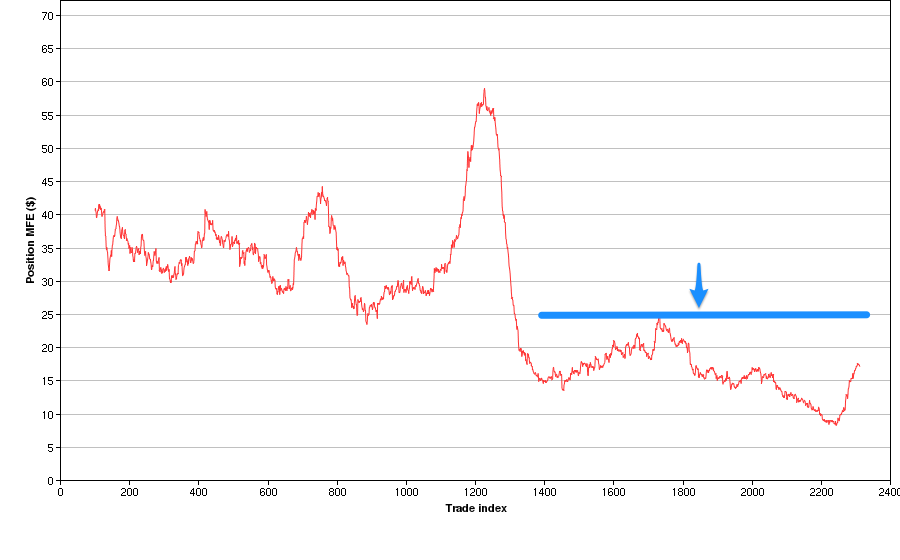
Now let’s look at the Position MFE moving average chart:

trend_posmfe 2

We can now see that at the same time, it seems we no longer let our trades run in the positive direction. Whereas before this change, our stops were looser, but we also let trades run up about $25-60 before closing them; after the change, trades were usually cut after reaching a max P&L of $25.

Another tool in your chest to help evaluate your trading performance!

Simple stop analysis

A couple of weeks ago, I was having a conversation over email with someone who was trying different stops and wanted to evaluate their effect on his performance. After thinking about this a bit, I wanted to mention a quick and dirty way to see whether using wider stops is effective for you.

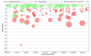
To create the following chart in Tradervue, I went to Reports, clicked the Advanced tab, and selected:

  • X-axis: Trade open date/time
  • Y-axis: Position MAE
  • Scale data points by trade P&L – checked

On the horizontal axis we’re plotting the trades against time; this doesn’t matter too much in this case, I just wanted to make sure we spread them out over the chart. On the vertical axis, we’re plotting the position MAE. This is the maximum interim loss we experienced in each trade. And finally, the size of each point represents the P&L of the trade. Green is a win, red is a loss, and the relative size of the point represents the magnitude…so big and red is bad, and big/green is good.

During this period, I was typically using stops on my positions that represented a total of $40 of risk. I was, however, experimenting with using larger stops for some trades.

So how did it go? Well, if we look at the -$40 line, all of the trades below that line were trades that had wider stops, and thus moved against me more than $40 at some point during the trade. I know this with certainty since, if they had stops of $40 or less, they would not have moved against me more than $40.

Looking at the trades below the -$40 line, I see that there were a couple of wins (these would be trades that moved against me more than $40 during the trade, but turned around and became winners), but many more losses.

So in this case, we can see at a glance that in these particular circumstances, widening my stops to more than $40/trade was not effective. Not at all!

This is, of course, a very simplified way to look at your stops, and there are many more factors you may want to consider…but this gives you a quick view of what actually happened, and may allow you to make some decisions more quickly.

[Advanced reports used for this post are available for all silver and gold subscribers.]

MFE and MAE calculations

Tradervue now calculates MFE and MAE statistics for your trades! This has been a very popular request, and we’re happy to have it in for you now.

When you view a trade, below the list of executions you will see the “Show trade stats” link:

Clicking that link to show stats will show the MFE/MAE data for the trade:

Tradervue reports four different stats here:

Position MFE – the maximum interim profit during the trade. Usually referred to as Maximum Favorable Excursion, and sometimes referred to as runup.

Position MAE – the maximum interim loss during the trade. Usually referred to as Maximum Adverse Excursion, and sometimes referred to as drawdown.

Price MFE – the maximum favorable price movement during the trade, independent of position size.

Price MAE – the maximum adverse price movement, independent of position size.

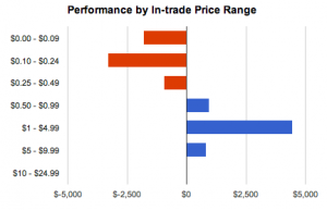
We have also added two related reports – Distribution and Performance by in-trade price range:

This shows your trading performance (or frequency) by how much of a price swing the trade experienced while you were in the trade.

Average position MFE/MAE is also available on the Detailed report stats, and also on the win vs. loss and compare report tabs.

These new statistics and reports are available now for all silver and gold subscribers!