Running positions now shown

Tradervue now shows you your running position when you view a trade’s details. For example, when viewing a trade, my execution list might look like this:

Note the new “Position” column – this shows your current total position, after that execution. This is especially handy for those folks who are trading in and out of a position a lot – you can tell at a glance whether you’re still long or short, and by how much.

Similarly, for shared trades:

In this case, the “Position” column reflects either “long” or “short”. It’s especially useful here; before, it was sometimes difficult to tell when a trader still had a position on, or if they were flat in the middle of a trade. Now, it’s quite clear what’s going on, even if they are scaling in and out of their position. This trade is a good example.

And of course, if the trader is sharing real P&L data, then the actual position size will be shown – here’s an example trade showing this data.

Bulk editing trades

Tradervue will now allow you to edit multiple trades at a time. When you’re in the Trades View, you’ll see an edit icon at the top left of the trades header:

If you click that button, you’ll see the bulk editor. There are checkboxes to select which trades you want (and that selection can be expanded to the entire set of filtered trades):

After you’ve selected the trades you want, you can do any of the following actions:

  • add a tag
  • delete a tag
  • set initial risk
  • share trades
  • unshare trades
  • merge trades
  • delete trades

This has been one of the most-requested features from Tradervue users; for example, quite a few folks wanted to more easily apply tags to a set of trades. This makes it easy!

Update 10/6/2015: added ability to set initial risk for trades using the bulk editor.
Update 1/9/2017: added ability to merge trades using the bulk editor.

Liquidity reports

Some brand new reports are now available! These are designed to analyze the liquidity you are adding/removing from the market, and more importantly, look at your trading performance as it relates to liquidity.

A quick primer on what we mean by “liquidity”:

Removing liquidity – when you place a marketable order, you are removing or taking liquidity. Examples of this would be a market order, or a limit order where your bid is at or above the current offer (or offer at/below current bid).

Adding liquidity – non-marketable orders add liquidity. When you enter a bid or ask into the market, but it’s not immediately executable, it sits on the book and is considered adding liquidity.

The new Tradervue reports analyze this in your trading, and help you pinpoint your performance as it relates to liquidity. For example, if you trying hard to add liquidity, but you’re generally losing money when you do, perhaps you should re-think your approach.

The first set of liquidity reports looks like this:
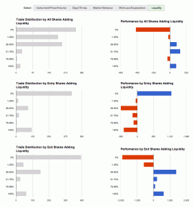
From top to bottom, your performance is plotted against:

– all shares in the trade that added liquidity
– entry shares that added liquidity
– exit shares that added liquidity

You can find those reports under the “Detailed” reports tab, as well as the “Win vs Loss” and “Compare” tabs. And these of course work with the usual filtering, so if you want to see your liquidity data for just short trades, or just AAPL trades, or compare your long vs short trades, that’s all at your fingertips.

And second, under the “Advanced” tab, you can find a chart like this:
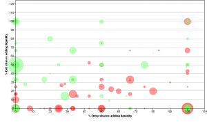
In this report, the X-axis is the % of entry shares adding liquidity, the Y-axis is the % of exit shares adding liquidity, and each trade is plotted with a circle. The larger circles are the larger wins/losses.

There is more detail on these reports, as well as the data requirements for using them, on the Liquidity Reports help page.

These reports require imported liquidity data from your broker or platform; at the current time, Lightspeed and PropReports both support this, as well as our generic import format.

The reports are available today for all gold subscribers!

Report on winning vs losing trades

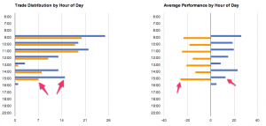
We’ve just added the ability to directly compare winning trades to losing trades. This can really give you some insight into what’s happening with your trading. Take this specific example, based on real trading data. We’re looking at a month’s worth of intraday trades; the hour-of-day summary view on the “Detailed” tab of Reports looks like this:

If we look at the 3:00pm hour, we can see a fair number of trades, but generally to no avail – the average per-trade P&L for that period is very close to zero. However, we don’t know exactly why…perhaps our stops are too tight?

Now, let’s look at the hour-of-day data broken down by winning vs. losing trades report for the same set of trades:

The legend isn’t visible in the screenshot, but the blue trades are the winning trades and gold are the losing trades. Now we can see a little better what’s happening. Looking at the distribution on the left, two thirds of the trades we’re making in this time period are winning trades! The problem is, the average loss on the losing trades is almost double the average gain on the winning trades. Now we have some real insight into what is really happening, and we can consider whether to make changes.

The winning vs losing trades reporting is now an available option on the Compare reports tab, and are available now!