Trend report additions – MFE/MAE

We’ve added some additional statistics to the new trend reports that were launched a couple of weeks ago. Specifically:

  • Position MFE, Position MAE – the max favorable/adverse excursion of a trade’s total position value
  • Price MFE, Price MAE – the max favorable/adverse excursion of the instrument price during a trade, independent of position size

These new additions can surface some interesting trends in your trading. For example, here’s a 100-trade moving average of Position MAE:

trend_posmae 2

The blue line isn’t part of the chart – it’s just there to help illustrate that at this point, we changed our trading methodology such that trades were given a maximum of about $20 of room to move against us; another way to say this is we tightened our average stops to something less than $20.

Now let’s look at the Position MFE moving average chart:

trend_posmfe 2

We can now see that at the same time, it seems we no longer let our trades run in the positive direction. Whereas before this change, our stops were looser, but we also let trades run up about $25-60 before closing them; after the change, trades were usually cut after reaching a max P&L of $25.

Another tool in your chest to help evaluate your trading performance!

Trend reports now available

Often we want to analyze trading performance not just as a snapshot, but over time – to see if we are improving, see if a particular strategy is working better/worse, etc. And while we can look at a cumulative P&L to see part of this, that doesn’t always tell the whole story.

Tradervue has introduced new trend reports to help with this analysis. From the Reports View, click the Advanced tab, then go to the Trends group:

trend1

Once you do that, you’ll be able to look at running averages of your per-trade P&L and your win rate. So for example, here we are looking at a 50-day weighted moving average of win %:

trend2

From looking at this chart, we can see a pronounced downturn around 10/2010, and we can use this information to help us drill down and understand what’s actually happening.

The trend reports can display P&L (in either $ or R), and win percentage, charted in one of two ways:

  • n trade moving average – this shows a moving average over the last n trades; the x axis will be the index into the list of trades being shown, sorted by open date/time.
  • n day moving average – this shows a weighted moving average of the per-trade P&L over the last n days. This is not an average of the daily P&L, but rather an average of the per-trade P&L.

As with all of the other reports in Tradervue, you can narrow the trade data used for the chart by using the trade filter. So, for example, you could look at the win percentage over time for one particular strategy (using tags), or just one particular symbol, or anything else you’d like to filter on.

For additional information on the trend reports, refer to their help page. And if there are other statistics you’d like to be able to view on these charts, let us know!

These new reports are available today for all silver and gold subscribers.

New advanced report features

We’ve been busy making Tradervue’s Advanced Reports even better! Specifically, we’ve added these parameters:

  • Market movement (%)
  • Market opening gap (%)
  • R ($)

The last one, R, is worth expanding on. Assuming you’re tracking your risk per trade, this lets you plot the amount of risk you had on for each trade (i.e. the R for the trade) vs. another field. So for example, if you were to plot P&L vs R, you could see if the trades you are putting on more risk with (i.e. higher R) are giving you higher returns.

We’ve also added the ability to download the data shown in any advanced report to a CSV file, which you can open in Excel or another spreadsheet. To do this, simply create the report you want, and then click the download button:

adv-download

Advanced reports are available for all silver and gold users – if you haven’t tried them yet, this might be a good time to consider upgrading!

Calendar Reports

We’ve added new reports to let you view your trading performance on a calendar. To view the calendar report, go to the Reports View, Overview tab, and click the Calendar group:

cal1

You’ll then be able to select a year, and you’ll see the calendar for that entire year. Each day will be colored – green for positive days, red for negative, blue for flat, and gray for days with no trades:

cal2

If you click on one of the months, you’ll see a detail view of that month. Each day will show the number of trades on that day, and the P&L (either aggregate or average, and reported in $, ticks, or R depending on your setting):

cal3

Clicking on an individual day in the calendar will take you to that day’s page in the Journal View, so you can review the individual trades on that day.

These reports make it possible to see certain kinds of patterns at a glance. For example, if we look at this month:

cal4

We can see very quickly that every single Thursday and Friday in the month was a losing day. We can then take a closer look at those days, and use the detailed reports to drill down and understand what might have been happening there.

Calendar reports are available now for all users!

Swing trades in Tradervue

Today, we have overhauled the way Tradervue works for swing trades (or any multi-day trade). There are some small changes for intraday traders as well.

When Tradervue was first released back in 2011, its feature set focused on the needs of active intraday traders. Since then, we’ve enhanced these features dramatically…but over time, more and more traders were using it for overnight (or longer) trades. So now, we’ve gone through and made it work much better for these folks.
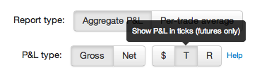
P&L Calculations

Tradervue now calculates realized P&L as of the date it occurs. Consider this trade:

realized1

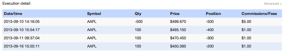
The initial entry was on 9/10, along with a partial close later on 9/10, and scale-outs on 9/11 and 9/16. In the past, this trade would just be shown in Tradervue as “open”. Now, the trade details show the realized P&L:

realized2

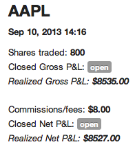
The trade is still shown as open, but the realized gross/net calculations are shown in italics. And on the Trades View, the realized data is also shown:

realized3

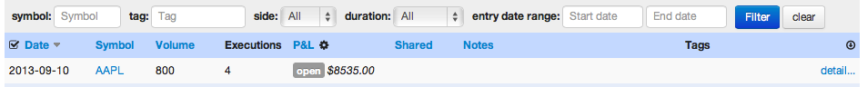
In the Trades View, the date in the left column is always the entry date of the trade. Additionally, when you use the filter to filter your trades, the start/end dates will filter on the entry date.

Realized P&L is calculated using a First-in, first-out (FIFO) methodology.

Journal View

In the past, trades were only shown in the Journal View on their entry date. Now, multi-day trades will be shown in the journal on every day there is activity. So here is an example of a day in the Journal View with several intraday trades, and a swing trade being opened:

realized4

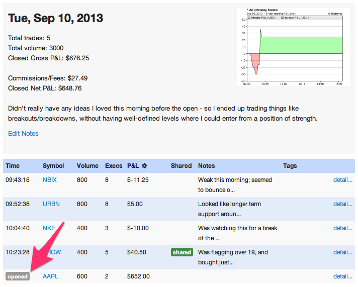
Note the label in the left column shows “opened”, which means this trade was opened on this day, and remained open. The P&L for that trade ($652.00) is the realized P&L for the trade on this day – if you refer to the trade detail above, you’ll see this is from the covering of the first 100 shares. The total P&L data for the day includes this value, since it has been realized.

Here’s how it looks for a day where an existing trade was adjusted:

realized5

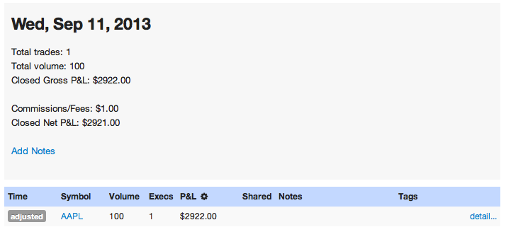
Here the left column says “adjusted”. The P&L shown for that trade, and for the day as a whole, is the P&L realized from this trade on this day only.

Finally, when we close a trade that has been open:

realized6

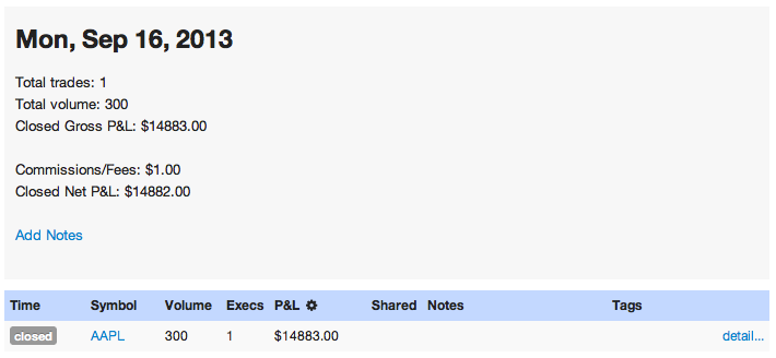
The left column shows “closed”. The P&L shown here is the P&L realized for this day only; it is not the total closed P&L for the trade (that total is shown on the Trades View, and the trade detail).

In a nutshell, the Journal View breaks things down by day, and every day you touch a trade you’ll see an entry there, showing what happened and the realized P&L for that date. You can make notes on each of those days if you wish, and you can see how your P&L for a trade was realized throughout the trade’s lifetime.

The Dashboard will show the same opened/adjusted/closed data as the Journal View, except just for the most recent trading day.
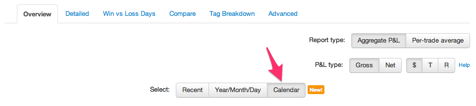
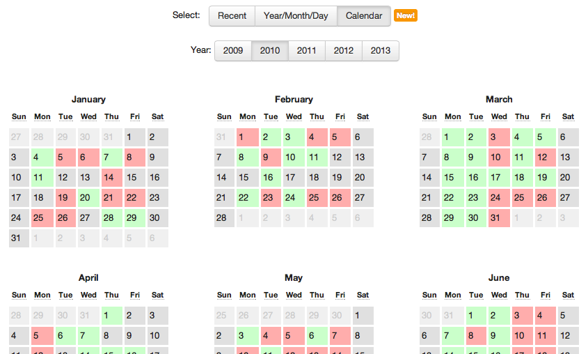
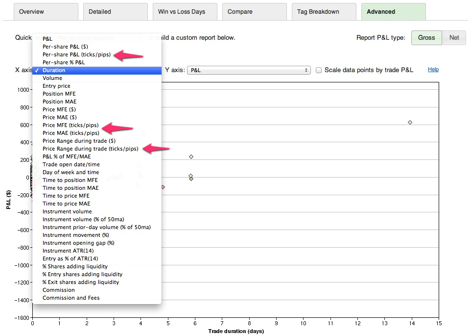
Reports

The Overview reports now show data differently:

realized8

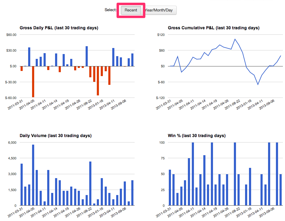
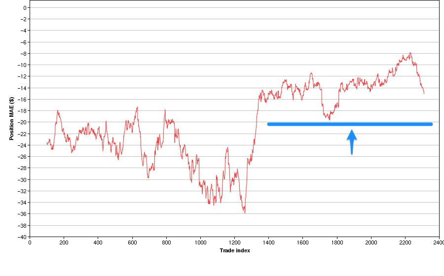
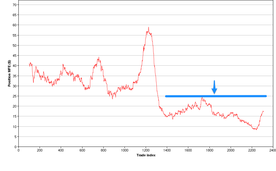
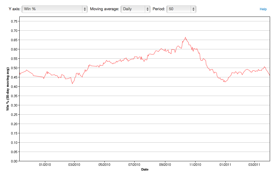
In the Recent report group, the Gross Daily P&L and Gross Cumulative P&L will now show P&L as it is realized, as opposed to on the entry date of the trade. The Daily Volume report will now show volume on the day it occurred. The Win % is based on the trade entry date.

realized9

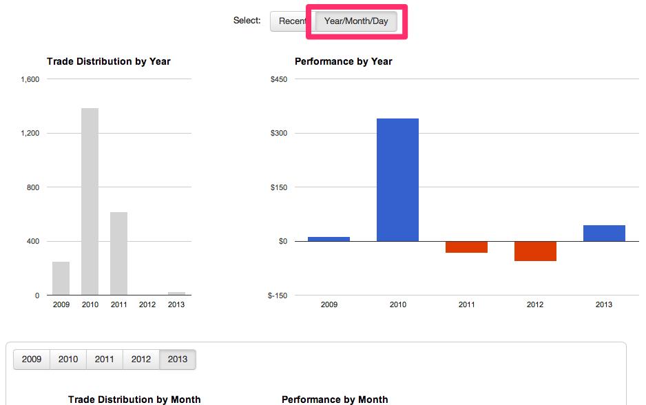
On the Year/Month/Day report group, all P&L is now shown on the date it was realized.

The Detailed reports use the trade entry date for their calculations, with the exception of the Cumulative P&L and Cumulative Drawdown (in the Win/Loss/Expectation group), which use realized dates. The Win vs Loss Days and Compare reports are calculated in a similar manner to the Detailed reports.

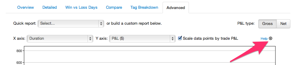
Advanced reports use the trade entry date, in cases where a date is relevant.

Currency Conversions

For trades that are settled in other than USD (e.g. Forex and Eurex futures), Tradervue calculates P&L in the native currency, and then converts to USD for reporting. In the past, this conversion would be done using the exchange rate at the time of the closing execution of the trade. Now, each time there is realized P&L in a trade (e.g. each execution in the closing direction), the exchange rate will be determined as of that execution time.

In the case of long-running trades, during which the exchange rate may move considerably, this improves the overall conversion accuracy for the trade.

New tick reporting

For futures traders, we have added the ability for all of the reports to display P&L data in ticks rather than $ (or R). When you visit the reports, you will now see an additional available mode, depending on your subscription.

Silver users will see the new tick mode:

reptick2

And gold users will see the tick mode, in addition to their gross/net and R options:

reptick1

Clicking the “T” will switch all P&L values in the reports to be in ticks, rather than $.

A couple of important notes about this:

  • Only futures trades will be shown in tick mode. Other trades will not appear in the reports when in this mode.
  • While each trade may have a different tick size (e.g. ES vs CL trades), the reporting normalizes them to just “ticks”. So if you made 2 ticks in an ES trade, and 5 ticks in a CL trade, the combined P&L for the two trades will be displayed as 7 ticks.

Tick reporting is available today for all futures trades!

Recent P&L chart now interactive

The new Recent report group on the Overview reports has been very popular since its introduction a couple of months ago.

Today, we have improved them by making the 30-day P&L chart interactive. You can now click on a bar for a specific day, and automatically filter your trades down to just that day so you can quickly investigate them in more detail:

recent_interactive

While most of the interactive reports in Tradervue require a silver or gold subscription, this one is enabled for all users!

Overview reports enhancements

Up to now, the Overview reports offered an aggregate P&L for a particular year or month. Now, similar to the other reports, we’ve added a report type setting to switch them to a per-trade average:

You can now review the months of a year and compare your average per-trade P&L, in addition to the total P&L for the month.

Here’s the aggregate version:

And the per-trade average version:

Overview reports are available for all users!

Reporting by Month

We’ve all heard “sell in May and go away”…but how much truth is in that? Well, now you can see for yourself, with your own data.

Now on the Detailed reports tab, Days/Times group, you will see the Distribution/Performance by Month of Year report…see your historically best and worst months, and plan your vacation! 🙂

There are also reports by month on the Overview reports tab – the difference is that on the Overview report, the months are shown for a specific year. On the Detailed tab, the “Jan” month includes trades from every January.

These new reports are available now for all users.