Consecutive wins/losses

The statistics table at the top of the detailed reports page now shows the maximum number of consecutive wins and losses:

Each side has a “show” link – if you click on that link, you will see the particular sequence of trades that’s making up the consecutive win/loss streak. In addition, when you do this the global filter is modified to just show those trades; that means you can browse through the rest of the reports, and see data for only the particular sequence of trades.

So for example, say you had a losing streak of 20 trades. If you click on the “show” link, you’ll see just those 20 trades. Then go back to the detailed reports page, and go to (say) the liquidity group – you might find your losing trades all have something in common that you didn’t expect.

Note that this, just like all other data in the statistics table, is reporting on the trades that are selected via the global filter bar. If you filter on just SPY trades, for example, the consecutive wins/losses will be just for the SPY trades.

The max consecutive wins and losses is available for all users – go take a look!

Redesigned Advanced Reports

Back in April, we introduced the Advanced Reports to Tradervue. At that time, there were just three, and we added another when we introduced liquidity reporting.

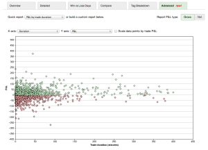
But today, I’m happy to announce that the Advanced Reports have been totally redesigned, and there are now literally hundreds of reports to choose from. Here’s an example of how they look now:

You can choose a “Quick report” from the drop-down at the top, or you can customize the reports by choosing exactly what to plot on each axis of the chart. You can also add a third dimension, where each trade data point is sized based on the trade P&L (either gross or net, depending on your report setting).

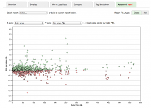
So for example, here’s a different report showing per-share P&L vs. entry price:

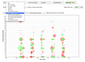
And another showing liquidity being added by day/time, also showing per-trade P&L as the size of the points:

We’ve reworked quite a bit about these reports; not only are they larger now, so you can better see your data, but they are all retina-display enabled. You can choose from the following data for the axes:

  • P&L
  • Per-share P&L
  • Per-share % P&L
  • Duration
  • Volume
  • Entry price
  • Trade open date/time
  • Day of week and time
  • % shares adding liquidity
  • % entry shares adding liquidity
  • % exit shares adding liquidity
  • Commission
  • Commission and fees

These changes are big, and give you views into your data that weren’t possible before. They are available today for all silver and gold subscribers, so go take a look! And if you’re not yet on the silver or gold plans, sign up today for a free trial!

New video on interactive reports

We’ve uploaded a video on using the new interactive reports. We walk through the trading for one particular trader, and analyze his trading performance when trading on the market open. In this particular case, we find that on Mondays at the open his performance is much better than other days, and we further look into whether aggressively opening positions (e.g. removing liquidity) is the winning strategy for this trader.

See the 3-minute video here: Using the Interactive Reports

And don’t miss the other videos, including a 6-minute getting started with Tradervue video; you can find them all at Tutorials and Help Videos!

Market movement reports are now interactive

Following up on the recent changes to allow drill-down into reports data, we have added this same capability to the market movement reports! That means, for example, when you’re looking at the Day Type report:

You can now click on a specific market day type, such as “Trend down”, and analyze only the trades you made on days where the market was in a trend-down day.

For a refresher on how Tradervue defines the different day types, see this post.

New interactive reports

Tradervue has always offered powerful filtering capability, allowing you to narrow down your trades to just the ones you want to see and analyze. Today, we’ve made this dramatically more powerful by adding the ability to drill down from the detailed reports to refine your filter.

Now, from the detailed reports tab, you can click on the bars in the report charts, and the current trade filter will be narrowed to just the trades making up that bar. For example, suppose you’re looking at the Days/Times group in the Detailed report, and you see the Performance by Day of Week chart:

Monday looks like it’s been a good day; if you click on the blue “Mon” bar, you’ll be able to narrow down your trades:

Click OK, and you’ll only see trades from Mondays:

The Day of Week report is certainly less interesting now, but let’s now look at the Performance by Hour of Day report – remember we’re only looking at trades from Mondays, and breaking them down by hour of day:

We could now click on the 9:00 bar, to filter by only trades on Mondays in the 9:00 hour.

With this new filter active, we’ll go over to the Market Behavior group, and we can see that we’re historically profitable no matter what the market conditions, on Mondays in the 9:00 hour:

Compare that with the overall performance (all of our trades) based on market movement:

And we can see that we are indeed doing something different on Mondays on the open. We can now use any of the other reports, or even look more closely at the individual trades, and analyze what we’re doing differently on those first trades of the week.

When we have filters active that aren’t normally exposed from the global filter bar, we’ll see the green bar expand and show us the additional filters we’re using:

It’s not just days and times; this works with the Instrument/Price/Volume, Days/Times, Market Behavior, and Liquidity groups on the Detailed reports tab. It also works on the Compare tab. And when you click in one of the reports, the new filter is additive to the existing filter – so you can refine your filter as you go.

This is quite powerful – give it a try with your own trading data, and see what you can uncover!

Interactive reports are available for all silver and gold subscribers.

UPDATE: the Market Behavior report groups now support interactive drill-down as well!

Liquidity reports

Some brand new reports are now available! These are designed to analyze the liquidity you are adding/removing from the market, and more importantly, look at your trading performance as it relates to liquidity.

A quick primer on what we mean by “liquidity”:

Removing liquidity – when you place a marketable order, you are removing or taking liquidity. Examples of this would be a market order, or a limit order where your bid is at or above the current offer (or offer at/below current bid).

Adding liquidity – non-marketable orders add liquidity. When you enter a bid or ask into the market, but it’s not immediately executable, it sits on the book and is considered adding liquidity.

The new Tradervue reports analyze this in your trading, and help you pinpoint your performance as it relates to liquidity. For example, if you trying hard to add liquidity, but you’re generally losing money when you do, perhaps you should re-think your approach.

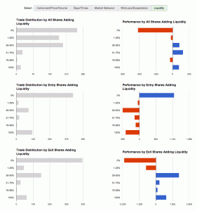
The first set of liquidity reports looks like this:

From top to bottom, your performance is plotted against:

– all shares in the trade that added liquidity
– entry shares that added liquidity
– exit shares that added liquidity

You can find those reports under the “Detailed” reports tab, as well as the “Win vs Loss” and “Compare” tabs. And these of course work with the usual filtering, so if you want to see your liquidity data for just short trades, or just AAPL trades, or compare your long vs short trades, that’s all at your fingertips.

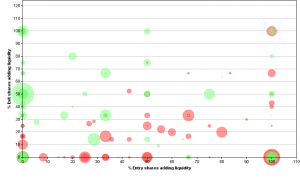
And second, under the “Advanced” tab, you can find a chart like this:

In this report, the X-axis is the % of entry shares adding liquidity, the Y-axis is the % of exit shares adding liquidity, and each trade is plotted with a circle. The larger circles are the larger wins/losses.

There is more detail on these reports, as well as the data requirements for using them, on the Liquidity Reports help page.

These reports require imported liquidity data from your broker or platform; at the current time, Lightspeed and PropReports both support this, as well as our generic import format.

The reports are available today for all gold subscribers!

Report on winning vs losing trades

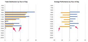
We’ve just added the ability to directly compare winning trades to losing trades. This can really give you some insight into what’s happening with your trading. Take this specific example, based on real trading data. We’re looking at a month’s worth of intraday trades; the hour-of-day summary view on the “Detailed” tab of Reports looks like this:

If we look at the 3:00pm hour, we can see a fair number of trades, but generally to no avail – the average per-trade P&L for that period is very close to zero. However, we don’t know exactly why…perhaps our stops are too tight?

Now, let’s look at the hour-of-day data broken down by winning vs. losing trades report for the same set of trades:

The legend isn’t visible in the screenshot, but the blue trades are the winning trades and gold are the losing trades. Now we can see a little better what’s happening. Looking at the distribution on the left, two thirds of the trades we’re making in this time period are winning trades! The problem is, the average loss on the losing trades is almost double the average gain on the winning trades. Now we have some real insight into what is really happening, and we can consider whether to make changes.

The winning vs losing trades reporting is now an available option on the Compare reports tab, and are available now!

Performance by Tag Report

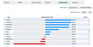
Another of the new reports introduced last week is the Tag Breakdown report. Here’s an example:

It shows you each of your tags, along with the number of trades using that tag and the total or average P&L for each of them.

If you’re using tags for the setups you’re trading, for example, then it’s easy to see very quickly which setups are working this week, and which ones aren’t. I’ve spoken to several folks who have sometimes been surprised; they thought a setup was working ok, but in reality it was responsible for the largest losses of the week/month/etc. When combined with the trade filter, this new report makes that information quickly available.

The tag report is available to all silver and gold subscribers.

Day Type report

Another report added recently to the Detailed Reports tab, available for all users, is the Day Type report. Here’s an example:

This shows your trading performance based on the type of movement in the overall market that day, be it trend day, range day, etc.

For clarification, here are the definitions Tradervue uses for the different day types:

Inside Range day – all trading was within yesterday’s price range

Trend Up day – closes above yesterday’s high, opens in bottom 15% of day’s range, and closes in top 15% of day’s range

Trend Down day – opposite of trend up day

Outside Range day – trades at least partially outside yesterday’s range, but was not a trend day

This report may offer some unexpected insights into your trading!

New Reports

With last week’s update, there is a new set of reports under the “Advanced” tab in the Reports View, for silver and gold subscribers. These new reports are:

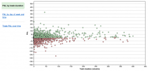
P&L by trade duration

This report plots all of your trades matching the current filter, by the duration of the trade. An easy way to tell, for example, if the trades you are holding longer are performing better.

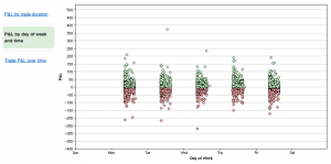
P&L by day of week and time

This report plots your trades matching the current filter against the day of week and time of day they were placed. This one is particular interesting for folks trading futures, not necessarily limited to the regular daily trading session.

Trade P&L over time

This report plots your trades matching the current filter against the date and time they were opened. You can look at an overview as shown above, or zoom into just a single day or week and see your trades based on time of day.

There will be more of these types of reports coming – let us know if you have ideas as to what you’d like to see!