Renko, Range Bar, and Volume Bar charts

Tradervue has always auto-generated price charts for your trades, on multiple timeframes, with your executions plotted. Now, we have greatly expanded this with three new chart types!

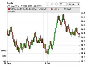
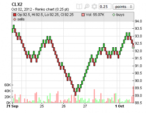
Renko charts – These are price charts where a bar is filled when the price exceeds a specific range, and will usually look like a series of diagonal lines:

In the above example, we’re showing a 25-tick Renko chart for CLX2. The bar size can be specified in either points or ticks. Renko charts are not time based – each bar may represent an arbitrary amount of time.

Range Bar charts – In a range bar chart, each bar represents a specific magnitude of price movement, and all price bars will be the same height. They are not time based. Here’s an example of a 25-tick Range Bar chart for CLX2:

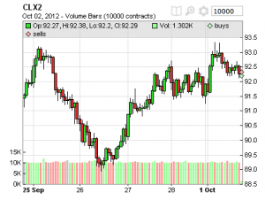
Volume Bar charts – in a Volume Bar chart, each bar represents a fixed amount of volume. They are not time based. In the below example, we’re looking at a 10,000-contract volume bar chart in CLX2:

Executions are plotted on all chart types, and studies are available for all of them as well. To change a chart type to any of the above, or to switch between Candlestick and OHLC, click the gear icon at the top of each chart. You can also change the chart defaults to include these new chart types in your Chart Settings – from the Tradervue Dashboard, click Settings, then go to the Chart Settings tab.

These new charts are all available today – Renko, Range Bar, and Volume Bar charts are available for silver and gold subscribers, and Candlestick and OHLC charts are available (as before) for all users.

Chart studies and comparisons

With this week’s release, Tradervue now supports adding studies and comparisons to the auto-generated price charts for silver and gold subscribers. If you normally use, say, an EMA(20) on the 5-minute chart when you’re trading, then you can see the same in your journal when you’re reviewing later.

Here are a few examples of the new studies in action:
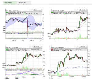
The supported studies include:

  • Exponential Moving Average
  • Simple Moving Average
  • Bollinger Bands
  • Donchian Channels
  • Average True Range
  • MACD
  • RSI
  • Fast and Slow Stochastics

If there are studies you need, but they’re not on the list, let us know and we can likely get them added for you.

If you click the study icon above each chart (next to the zoom icon), you’ll see the study editor for that chart, where you can choose studies and edit parameters:
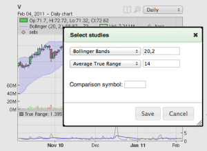
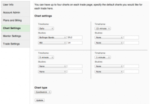
You can also set studies in your chart defaults, so all of your trades will start out with the same set of information. To do that, go to your account settings (either from the dashboard, or click your user name in the header), then click the Chart Settings tab:
You may have also noticed in the pictures above that comparison charts are also supported; if you want to see, for example, how SPY is moving compared to the stock you’re trading, you can do that:
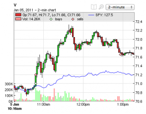
The price for the comparison symbol is normalized to the symbol you’re comparing it to, so they will fit nicely on the same chart. You can use the comparisons with markets, sectors, other stocks/futures, or whatever you like!

Big update today, including new subscription plans

We’ve launched a ton of new features today, along with rolling out new silver and gold subscription plans with even more great features. Among the new additions:

  • New reports! A P&L overview, performance by tag, detailed views of performance by trade duration and other dimensions. And even a new report of performance by market day type (e.g. trend day, range day, etc.).
  • Commission and Fee Tracking. One of the most-requested features since the launch is now available!
  • Chart studies and comparisons. You’ve already had auto-generated price charts; now, you can add studies such as moving averages, MACD, bollinger bands, and many more to your charts. Plus, you can add another symbol to your charts for comparison purposes.
  • Dashboard. A new dashboard will greet you when you log in, helping you see at a glance what’s happening with your recent trading.
  • Import preferences. You can now tweak the trade grouping behavior that is used when you import your trades. If you’re one of the folks who splits or merges all of their trades every day, this can now be automated to save you some time.

I’ll add posts here over the next few days detailing all of these new features…but in the meantime, head on over to Tradervue and start seeing how it could improve your trading performance!

New running P&L charts

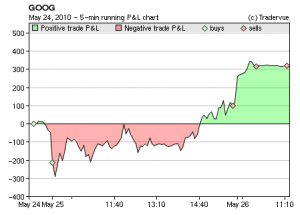
We’ve added two more charts to Tradervue, which display your running intraday P&L.

On every trade detail page, where you used to see your selected price charts, there are now two tabs – “Price Action” and “Running P&L”:

The Price Action tab shows you the same price charts you saw before, on your chosen timeframes with your trade executions plotted.

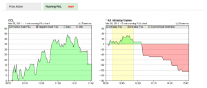
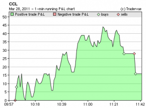
Clicking on the “Running P&L” tab will show you the new P&L charts. The one on the left will be the intraday P&L for the current trade only:

This is displaying the sum of both realized and unrealized P&L, and is displayed with either 1-minute or 5-minute resolution depending on how long the trade lasts.

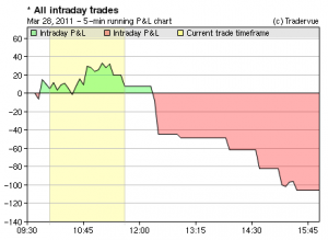
The chart on the right will show you running P&L for all intraday trades on that particular day:

The zone in yellow is the timeframe represented by the current trade, so you can see how the particular trade you’re looking at fits into the overall P&L picture for the day. This chart is always shown in 5-minute resolution.

At the current time, these charts will only display for intraday trades.

As always, if you have any feedback or suggestions, please send them to us at support@tradervue.com!

Adding charts – now much easier!

As our support mailbox can attest, it seems that it’s not obvious that you can add additional charts to your trade views beyond the two that it defaults to when you create a new user account. So, we took the hint and changed some of the GUI on the trade screen.

As before, you can change your chart settings in the User Settings area, which you can get to by clicking your username in the upper right corner, or clicking “Change default chart settings” at the bottom of every trade screen. You can set the default timeframes your charts will use, how many charts you will see, and the type of chart you want.

And, as before, you can override your default timeframes on your charts for a particular trade by changing the timeframe in the drop down list above each chart.

But now, you can also add charts on a per-trade basis. So for example, if you have two charts set as your default, but for one particular trade you want to have three charts, it’s now quick and easy – you just click the add chart button!

This won’t change your defaults – it will just quickly add a chart to the trade you’re looking at.

Weekly charts added

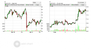
We have added weekly price charts to the available intervals. You can use them by selecting “Weekly” from the chart intervals on individual trade pages, or click on your username at the top right of the application and click “chart settings” to change your global default chart settings.

Chart timeframe change

The focus with the Tradervue price charts has been to show you the price action up to and including your trade, so you can evaluate your decision process. However, since even before the public launch we have had a number of requests to show price action after the trade is closed as well.

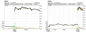
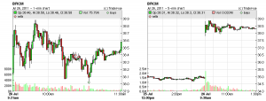
Here is an example of one trade’s 1- and 5-minute charts as they were before (click for larger versions)

But now, we’ve made some changes to show you more data after the trade is closed, as long as we can do so without compromising the view you see prior to your trade. Here are the same charts for the trade above, as seen now:

You can see the 5-minute chart extends to the end of the trading day, and the 1-minute chart still shows plenty of pre-trade data, but also shows a half hour or so after the trade is closed.

New reports added

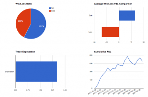
We have added four more charts to the reports section of the site; specifically:

  • Win/loss ratio
  • Win/loss P&L comparison (aggregate or average)
  • Trade expectation
  • Cumulative P&L

These reports are especially useful when you use them in conjunction with tag and/or date filters. For example, if you tag your breakout trades with “breakout”, then you can display these reports for just your breakout trades if you wish.

Seeing your average trade expectation or cumulative P&L for just a certain kind of setup can really help you see when a particular setup isn’t working well for you any more, and help you pinpoint the changes you might want to make.

If you’re already signed up for Tradervue, head over to the reports view to see the new analysis. And if you’re not signed up, well, maybe now is the time!